3.4 Download and graph a city’s median income
quantmod includes a function that lets you import data directly from the U.S. Federal Reserve – more specifically the St. Louis Federal Reserve’s FRED database.
I went to FRED at https://fred.stlouisfed.org and searched for “median household income for San Francisco.” This wasn’t to get the data, but to find out which table contains the data. The URL for FRED’s “Estimate of Median Household Income for San Francisco County/City, CA.” was https://fred.stlouisfed.org/series/MHICA06075A052NCEN. The character/number string after fred.stlouisfed.org/series/ was what I needed; it’s the St. Louis Fed’s symbol for this data.
You may want to do the same search, so you can copy the MHICA06075A052NCEN portion of it into your clipboard from the FRED url instead of typing it manually.
Now try running the following code (I’ll explain it in a bit) for some instant R gratification (gRatification?). Being able to paste MHICA06075A052NCEN from your clipboard should make this less onerous.
sfincome <- getSymbols("MHICA06075A052NCEN", src="FRED", auto.assign = FALSE)
names(sfincome) <- "Income"
dygraph(sfincome, main = "San Francisco Median Household Income")
You should see a graph that looks like Figure 3.3 in the Viewer tab of RStudio’s lower right pane.
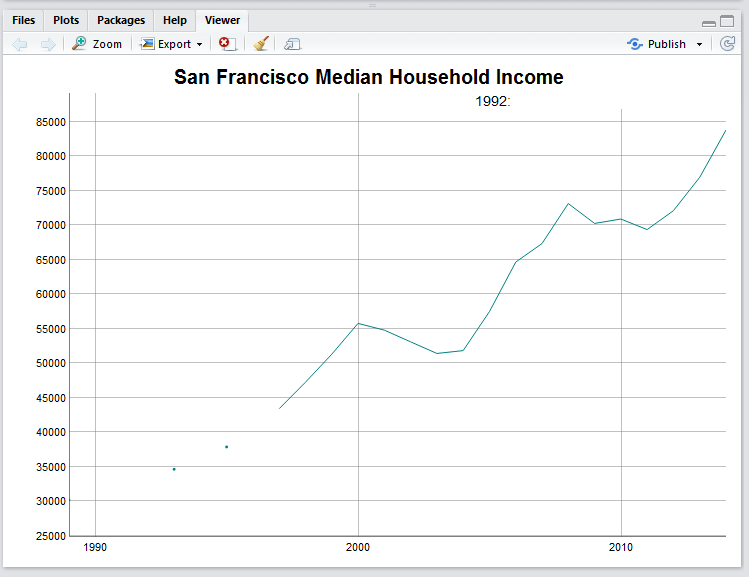
Figure 3.3: Graphing San Francisco household income with the dygraphs package.
The zoom button above the graph on the left will open the pane into a larger window. The icon showing an arrow pointing to the upper right will open the graph in a browser window (in the image above, it’s the icon directly over sco in San Francisco).
The graph is interactive. If you move your mouse from left to right anywhere on the graph, you’ll see information about the closest underlying data point in the top right of the window. And if you click and drag from left to right inside the graph to define a portion of it - say from 2000 to 2010 - the graph will zoom in. (Double-clicking zooms out again, or you can always refresh the page.) This graph can be saved as an HTML “widget” or exported to a static JPG or PNG image using the RStudio Export menu item in this Viewer pane.
To save this graph as an HTML widget, first store it in an R variable, such as sfmediangraph <- dygraph(sfincome, main = "San Francisco Median Household Income"). Next, install the htmlwidget package with install.packages("htmlwidgets") and load it with library("htmlwidgets"). Finally, use the saveWidget() function to save your sfmediangraph object to a file, such as
Find the sfmediangraph.html file on your computer and open it in a browser. You should see the same interactive HTML graph as you saw in RStudio, but it is now reusable on another Web site.
If by any chance you’re thinking “This looks like a Web graphic I could make with JavaScript,” you’re right. The dygraphs package is an R wrapper for a JavaScript library, also called dygraphs. But with the R package, you can generate dygraphs JavaScript completely in R.
Now, the explanation of the code that I promised:
The first two lines load the quantmod and dygraphs packages into your current working session.
The third line uses quantmod’s getSymbols() function to pull data from an external source. The function takes two “arguments” – options that the function needs to do its job. That first argument, “MHICA06075A052NCEN”, is the symbol (the one we looked up at FRED) for retrieving data we want. The second argument, src=“FRED”, sets the data source to FRED, the St. Louis Federal Reserve’s database. And you saw “autoassign = FALSE” in the previous section.
If you check the structure of this sfincome object with str(sfincome), you’ll see that it’s a special type of R object dealing with time series. Data starts in 1989, and those NA data listings you see stand for “Not Available,” meaning that some points are missing (which you probably noticed on the graph).
The name of the lone data column with the median-income data is “MHICA06075A052NCEN”. The data column title shows up on the graph, and I don’t like that character string as my data label. So, in the fourth line, I change the name of that data column to “Income” with names(sfincome) <- "Income". You can also run names() on an R object without the assignment operator, such as names(sfincome), to see existing names.
(If you’re wondering why no name for the date column shows up, that’s how R time series are structured.)
The third line creates the graph, using the dygraph() function from the dygraphs package. The first argument, sfincome, tells dygraph what data set to graph. The second argument, main, is just the headline for the graph.