12.5 Visualizing election results
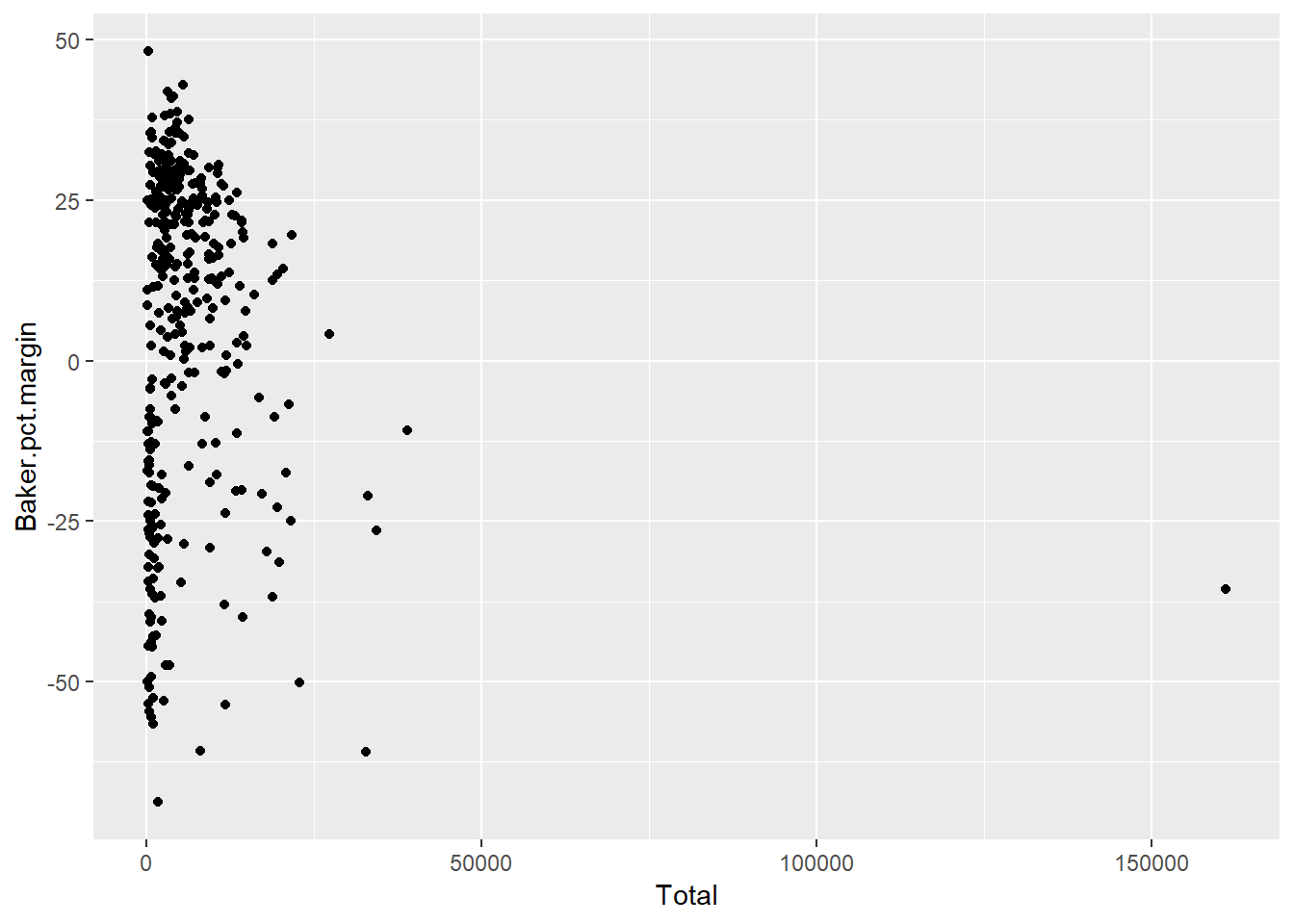
Is there a relationship between number of votes in a community and which candidate won? A scatterplot can help show trends. However, Boston is such an outlier population-wise, that it becomes difficult to see what’s happening in the rest of the state (Figure 12.6).

Figure 12.6: A scatterplot of population vs. percent victory margin.
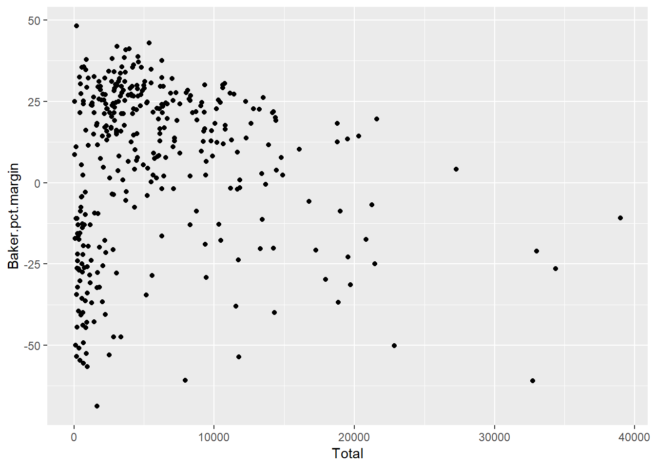
One approach is to simply remove Boston to get a better look at trends (Figure 12.7):
maplot <- ggplot(winners[winners$Place != "Boston",], aes(x = Total, y = Baker.pct.margin)) +
  geom_point()
maplot
Figure 12.7: Scatterplot with outlier Boston removed.
Another approach is to use a logarithmic scale, which can be a more useful way of visually exploring relationships in data without having to toss out one or two extreme outliers. However, there are two challenges in this example. One is that you can only take logarithms of positive numbers, so I’d have to re-do the data structure instead of using a negative margin for places Baker lost. The other challenge is that if you’re trying to tell a story to a mass audience, having to explain log scales in the midst of your election reporting may not be ideal. (That’s not a problem when creating for-your-own-use data explorations, though.)
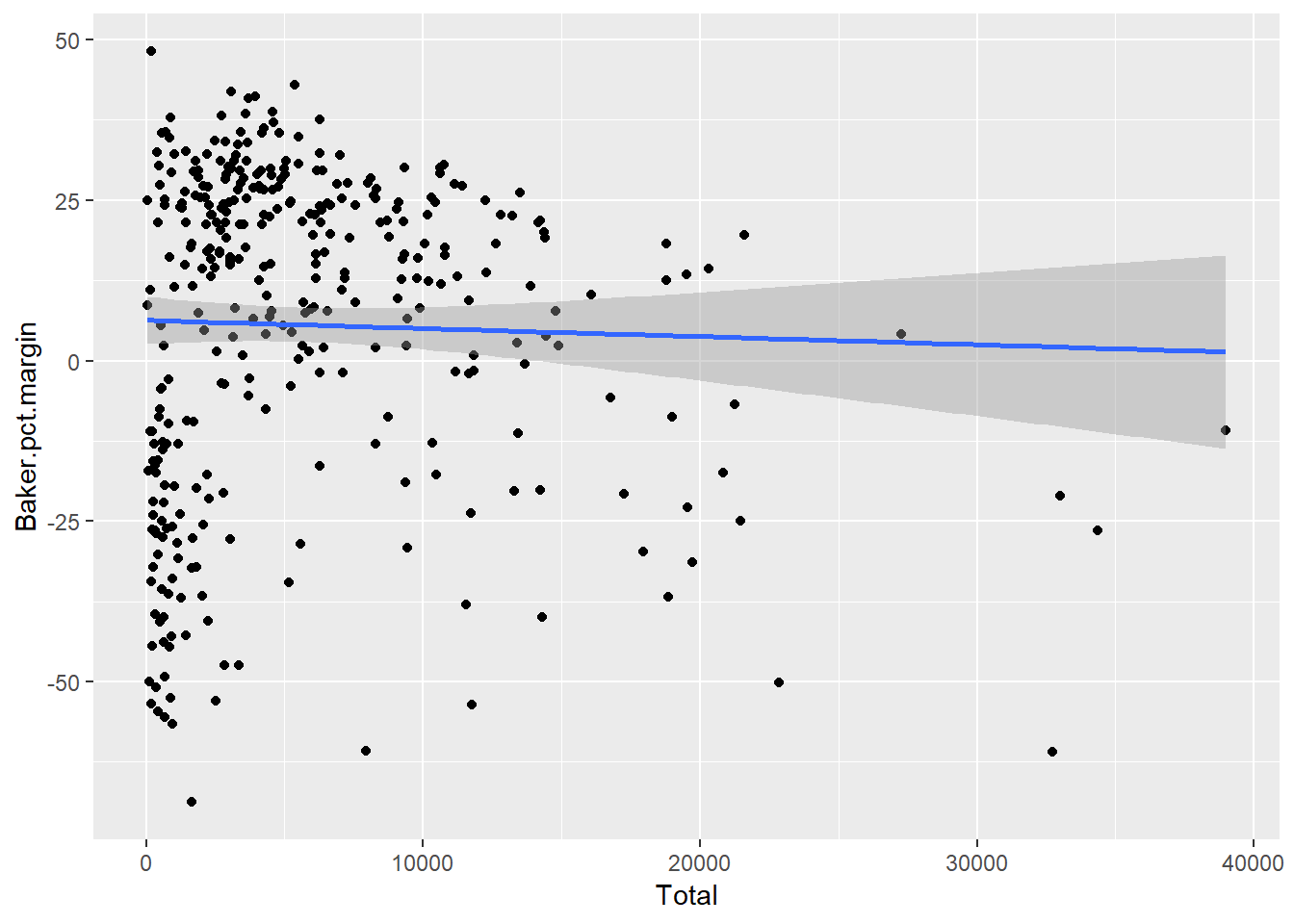
So I’ll stick with the Boston-less scatter plot for now. If there’s a pattern, it’s not very visually dramatic. If you understand linear regression – finding a trend line of best fit among points – you can add a linear-regression line easily with ggplot’s geom_smooth(method="lm"). (Caution: plotting a straight line isn’t always the best choice for scatter plots; it depends on characteristics of your data.)

Figure 12.8: Scatter plot with linear regression line.
Not much of a trend to see in Figure 12.8. Base R’s cor() function can calculate the statistical correlations:
## [1] -0.08767372cor(winners$Total, winners$Baker.pct.margin) will give more details, including statistics such as p-value and 95% confidence interval.
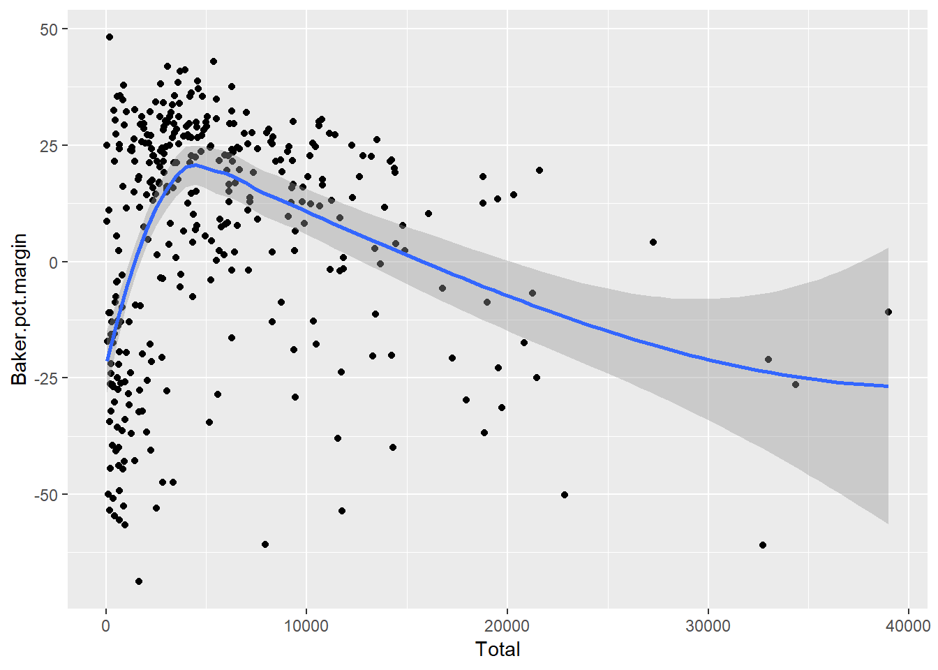
Finally, using geom_smooth() in ggplot2 without specifying lm (for “linear model”) lets ggplot determine what type of model to use, as in Figure 12.9:

Figure 12.9: Letting R pick the model.
If you want to do more correlation calculations, there are several R packages that might be of interest. corrplot is designed to visualize correlations; the package includes an introductory vignette that can tell you more. The corrr package is billed as “a tool for exploring correlations,” including rearranging correlations based on the strength of relationships.